OH! Website
Project Scope
Optimise Health (OH!) is a high-value client of Step Change, where I worked as a Senior UX Designer. Just 2 weeks in, I was handed this critical project. The CEO wanted "quick smarts" to save the business relationship with OH. The website is outsourced to a Web Development Company while Step Change handles the overall Marketing & Branding Strategy, and the OH! Website is one of the touchpoints being developed for Optimised Health (OH!).
User Experience Design (UX)
:: Streamlined the experience, reducing redundant pages, eliminating unnecessary steps
:: Improved the structure of the page/s, Site Map, and Navigation Menu of the website
:: Provided feedback to improve website forms
User Interface Design (UI) & Visual Design
:: Helped the Web Development team who struggled
in fully expressing graphically using design elements provided in the branding guidelines
in fully expressing graphically using design elements provided in the branding guidelines
:: Designed the layout of the web pages for the Web Dev team to implement
:: Improved presentation on sections of the website through illustrations and animations which the client loved
Other Roles
:: Provided Creative Direction to the Web Development team
:: Lead the team on different phases of the project
:: Lead the internal team to create the animations and illustrations
:: Provided feedback to Web Dev Team and kept an eye on the project
OH! Branding Manifesto
Step Change has Branding Guidelines prepared for OH! To help the web dev team improve the website and user interface, I took cues from the Branding Guidelines to give the team the creative direction it needs.

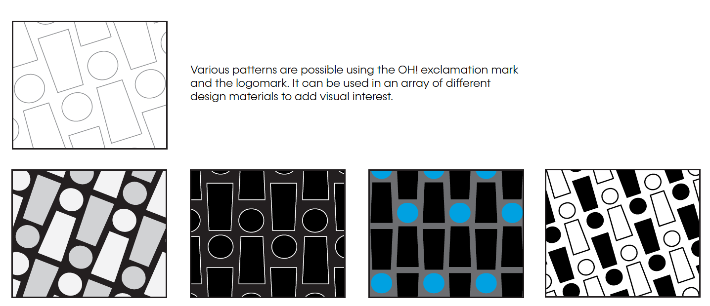
Highlighted (above) are the keywords from the Branding Manifesto and Tone of Voice, including icons and patterns designed which I saw should be utilized to add visual interest.
I dug further into the Branding document as I learned more about OH, trying to understand the way they categorized their services. I've suggested ways to organize, drafted Information Architecture and charts to check with the internal team who know more about the client, and helped build the Branding Guideline document.
OH! Logomark Patterns (Above) found in the OH! Branding Guidelines.
There were existing patterns in the old site and they were good, but having more variations while sticking to a theme can add more visual interest while having that rhythm, as it's quite a medium to large-scale website.
There were existing patterns in the old site and they were good, but having more variations while sticking to a theme can add more visual interest while having that rhythm, as it's quite a medium to large-scale website.
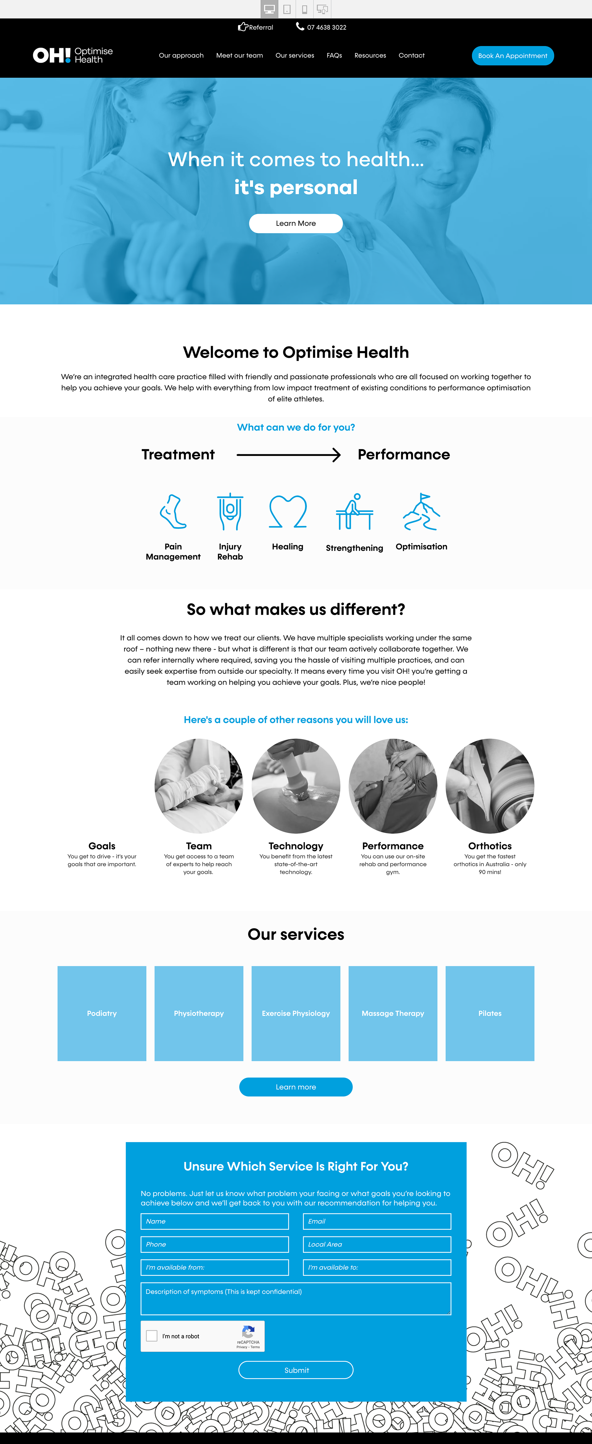
Before & After
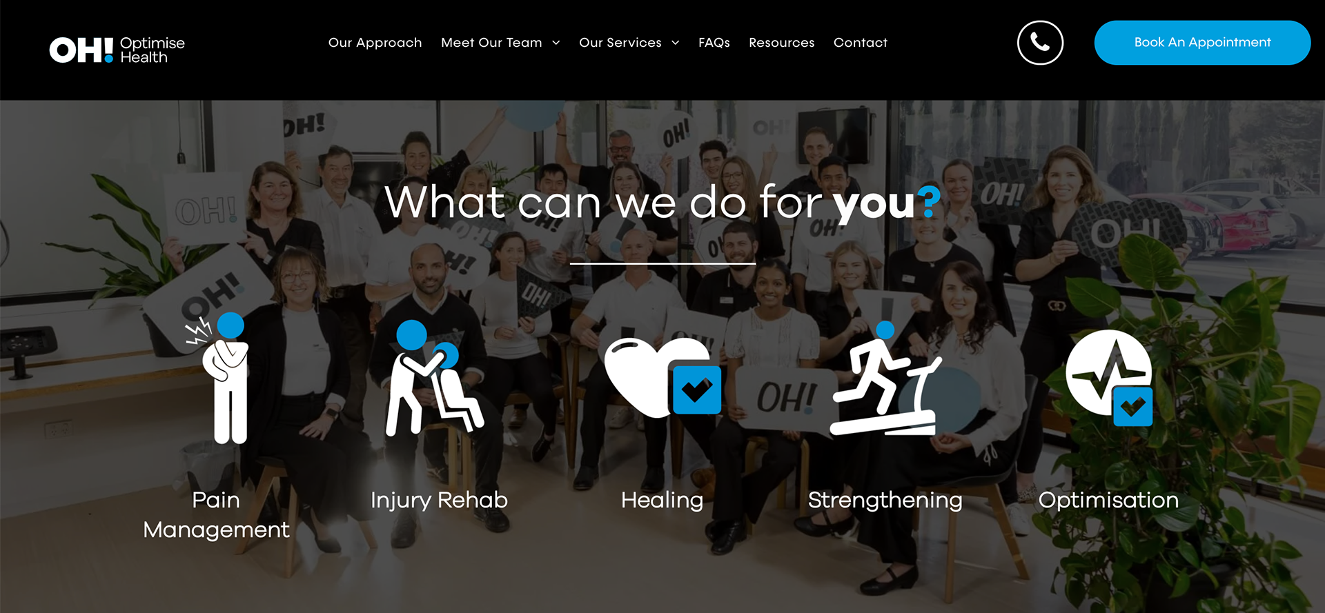
On the Left is the (old) website we were trying to fix | On the Right is the new design we fixed

Before & After (Above): The homepage when I came on board (left), and the homepage I helped redesign (right)
Finding Opportunities to Shine
On Issues Found that Needed Fixing
On Issues Found that Needed Fixing
1. Images should be in full colour not muted with blue.
The OH! brand is bold and confident, not afraid of a splash of colour. I saw that the client has very good, high-quality photographs executed professionally. To me, the photos featuring the staff and facilities of the client itself has a major role in representing the brand more accurately. Let it shine!
2. The blue should be used as an accent only, just like the dot in the logo.
The client has called out the (overuse) of blue colour. The nervous reaction is to get rid of blue, but having understood the misuse: an overuse, we don't have to get rid of it totally, just use it sparingly, as an accent. (Like the blue dot in the OH Logo, perhaps a 90-10% ratio.)
3. Break the uniformity of the blue squares and grey circles repeated throughout the website. Make use of custom icons designed for the different services, and animate them!
The Branding team did a great job designing different elements in the branding guidelines, so I felt like I hit a jackpot when I discovered there are different icons designed to represent each services that OH provides: Podiatry, Physiotherapy, Exercise Physiology, Massage Therapy, and Pilates!
These would help add spice and colour and make the website more dynamic and not static and boring, or "flat" as the client felt it was.
The Services Icons (Animations) brought to life! (Above) As seen on the live site.
Design Breakdown
The Services Page
More images, info & details will be added soon. Still working on updating this project... Please check back later! :D
Credits go to the whole Step Change Team and the outsourced Web Development Team whom I collaborated with on this project.